Cool Gaming Team Logo Design Inspired by Samurai for an Esports Brand
Cool Gaming Team Logo Design Inspired by Samurai for an Esports Brand

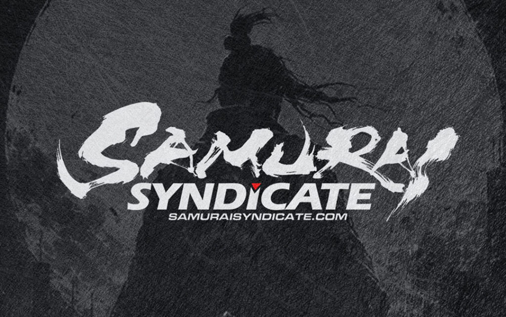
In this article, we introduce the logo design created for the gaming team “SAMURAI SYNDICATE.”
The name combines “SAMURAI,” which evokes a strong Japanese spirit, with “SYNDICATE,” suggesting unity, organization, and a powerful team identity.
For this logo design, we aimed to create more than just a Japanese-inspired visual. The goal was to express the speed, intensity, and stylish presence suitable for a modern gaming team.
By combining dynamic Japanese brush calligraphy with sharp contemporary typography, we created a bold and memorable logo that fits the world of esports and competitive gaming.
Expressing the Speed and Energy of “SAMURAI” through Brush Calligraphy
The Japanese brush-style lettering of “SAMURAI” is one of the most important elements of this logo.
Using the natural characteristics of brush calligraphy, we focused on energetic strokes, rough ink textures, dry-brush effects, and sharp movement. These details help express speed, impact, and the sense of a team ready for battle.
Rather than making the lettering too clean or polished, we intentionally kept the raw movement of the brush. This gives the logo a stronger sense of motion, as if the word itself is cutting through the air.
The brush texture also adds a feeling of intensity. Even though the logo is a static image, the stroke movement creates a sense of momentum and power.
A Sharp and Modern Look for a Gaming Team Logo
In contrast to the organic movement of the brush lettering, “SYNDICATE” is designed with a sharp and modern typographic style.
The bold, structured alphabet lettering helps communicate stability, strength, and team unity. It gives the logo a more professional impression, making it suitable for a gaming team, esports organization, or gaming-related brand.
By combining the expressive brushstroke style of “SAMURAI” with the clean, mechanical impression of “SYNDICATE,” the logo gains a strong visual balance.
This contrast allows the design to feel Japanese and powerful, while still maintaining a modern and stylish look that works well in the gaming scene.
The Meaning Behind “SAMURAI” and “SYNDICATE”
The word “SAMURAI” carries images of fighting spirit, pride, focus, discipline, and determination.
On the other hand, “SYNDICATE” suggests a united group, a strong organization, and people moving together toward the same goal.
In this logo, we combined these two ideas to express a team identity built on both individual strength and collective unity.
For a gaming team logo, visual impact is important, but it is also important that the design communicates the team’s personality and direction.
That is why this logo was designed not only to look cool, but also to express the image of a powerful team that fights together.
A Red Accent that Strengthens the Logo
A small red accent has been added to the logo as a visual highlight.
Within the strong black-based composition, the red detail draws the eye and gives the design a sharper impression.
Red also works well with Japanese-inspired design, adding a sense of intensity and energy without making the logo overly decorative.
By using red only in a limited area, the logo maintains a clean and stylish appearance while becoming more memorable.
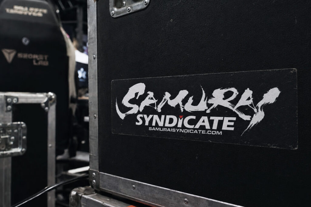
A Logo Designed to Stand Out in the Gaming Scene
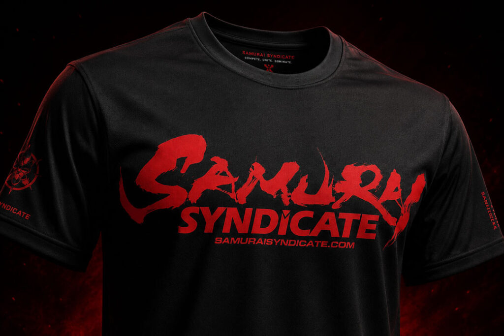
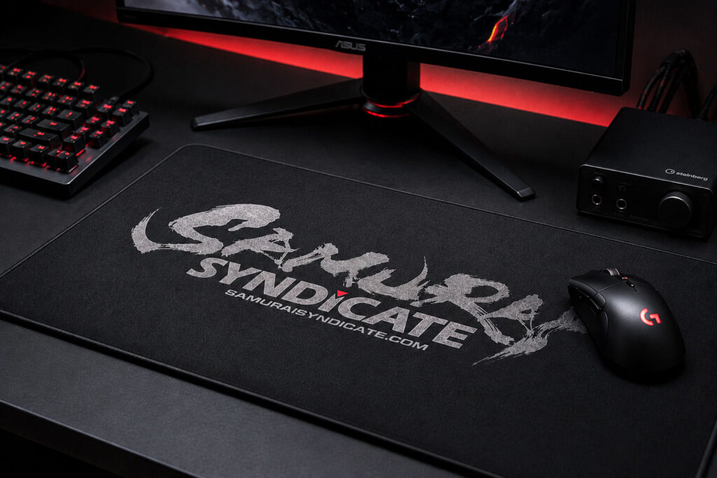
Gaming team logos are often used in many different situations, such as team uniforms, social media icons, streaming layouts, video thumbnails, stickers, mousepads, and event banners.
Because of this, a logo needs to have both strong visual impact and practical usability.
For SAMURAI SYNDICATE, we created a horizontal composition that gives the logo a strong presence while keeping the team name easy to recognize.
The brush lettering creates an immediate impact, while the alphabet typography supports readability and usability across different media.
Conclusion
The SAMURAI SYNDICATE logo design was created to express speed, power, and a modern gaming identity through Japanese brush calligraphy.
The brush lettering of “SAMURAI” uses energetic strokes, dry-brush textures, and sharp movement to express fighting spirit and momentum.
Meanwhile, the typographic design of “SYNDICATE” adds a sense of team unity, structure, and strength.
By combining Japanese calligraphy with modern esports-style typography, this logo creates a bold and memorable identity for a gaming team.
At SANTEN Design, we create Japanese brush calligraphy logos for a wide range of industries, including restaurants, brands, sports teams, apparel labels, and gaming teams.
For those looking for a logo that combines Japanese aesthetics with a modern and powerful visual identity, a custom brush calligraphy logo can be an effective way to create a strong and lasting impression.
For Those Considering a Logo Design
If you are thinking about creating a logo, please feel free to contact us.
Even if your ideas are not yet fully defined, that is absolutely fine.
We will listen carefully to your requirements and guide you through the process.