Japanese Brush Calligraphy Logo Design for the Premium Tonkatsu Restaurant “Katsu Kuramoto”
Japanese Brush Calligraphy Logo Design for the Premium Tonkatsu Restaurant “Katsu Kuramoto”

For the logo design of “Katsu Kuramoto,” we created a Japanese brush calligraphy logo centered around the sense of depth, dignity, and carefully crafted atmosphere often associated with long-established Japanese restaurants.
In this article, we will introduce the concept behind the “Katsu Kuramoto” logo design, as well as the design intentions behind the Japanese brush lettering and English typography.
A Brush Calligraphy Design Inspired by the Atmosphere of a Long-Established Tonkatsu Restaurant
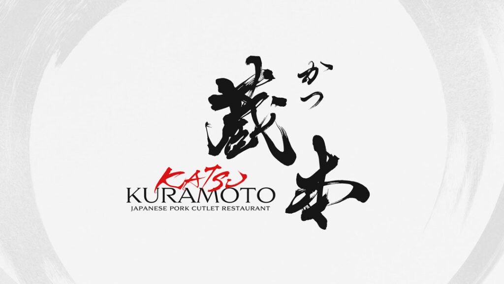
The Heavy and Dignified Brush Lettering of “Kuramoto”
For this brush lettering, we avoided adding overly decorative or flashy elements. Instead, we focused on creating an expression with a quiet yet powerful presence.
The design is based on thick, weighty brushstrokes, while subtle brush lifts and dry-brush textures were added in certain areas to create a traditional Japanese atmosphere.
At the same time, we carefully adjusted the flow and visual balance of the characters so that the design would not feel too forceful. The final logo was created to convey the calm elegance and refined impression suitable for a premium tonkatsu restaurant.
A Logo Design That Balances Strength with Refinement
Avoiding an Overly Rough or Heavy Impression
When a logo focuses too strongly on heaviness and impact, it can sometimes appear old-fashioned or overly rugged.
For this reason, we carefully adjusted the center of gravity, stroke movement, and spacing between the characters, creating a design that expresses strength while still maintaining a refined impression.
In particular, a slight softness was added to the flow of the brushstrokes, helping the logo convey the calm and elegant atmosphere expected of a premium tonkatsu restaurant.
In Japanese restaurant logo design, relying only on “power” can sometimes make the logo feel closer to an izakaya or casual dining brand.
For “Katsu Kuramoto,” we aimed to create a brush calligraphy design with a quiet presence, balancing the feeling of a long-established restaurant with a sense of premium quality.
Why Only “KATSU” Was Created in Red Brush Lettering
Visually Emphasizing Tonkatsu as the Core of the Brand
In the English text “KATSU KURAMOTO,” we did not use the same typeface for the entire name. Instead, only “KATSU” was created in red brush lettering.
This was done to visually emphasize “katsu,” the central element of the brand.
If the entire logo were composed only in black, it would create a strong and dignified impression, but it could also feel slightly too heavy or closed.
By adding red, we expressed the heat and liveliness of freshly fried tonkatsu, as well as the strong core of the restaurant itself.
The contrast between black and red allows the logo to maintain a traditional Japanese atmosphere while also creating a more modern and refined impression.
Creating a Premium Impression with a Classical Serif Typeface
English Typography Designed with a Japanese-Modern Feel
For the “KURAMOTO” section, we used a classical serif typeface.
By pairing the strength and raw energy of the brush lettering with calm and refined English typography, the overall balance of the logo was carefully adjusted.
If the logo were composed only of Japanese brush lettering, the Japanese visual impression could become too strong. By adding a refined English typographic element, we created a premium impression that can also be easily understood by international customers.
For Japanese restaurants and premium tonkatsu restaurants, inbound tourism and international customers are becoming increasingly important. Because of this, brand design today requires not only a sense of Japaneseness, but also a visual approach that works from a global perspective.
Conclusion
A restaurant logo should not simply look stylish. It is an important element that communicates the atmosphere, values, and character of the restaurant itself.
For “Katsu Kuramoto,” we created the logo with the following elements in mind:
- A sense of a long-established restaurant
- Depth and dignity
- A carefully crafted atmosphere
- Premium quality
- Japanese-modern design
Based on these elements, we aimed to create a Japanese brush calligraphy logo that can be loved and used for many years.
At SANTEN Design, we create each Japanese brush calligraphy logo as an original design, carefully tailored to the concept and atmosphere of each restaurant.
Whether you are opening a premium sushi restaurant, yakitori restaurant, kappo restaurant, tonkatsu restaurant, or another Japanese dining concept, please feel free to contact us if you are considering a custom Japanese brush calligraphy logo design.
For Those Considering a Logo Design
If you are thinking about creating a logo, please feel free to contact us.
Even if your ideas are not yet fully defined, that is absolutely fine.
We will listen carefully to your requirements and guide you through the process.