If you’re managing a martial arts or fitness brand, you may have asked yourself:
-
“How can I create a logo that really stands out?”
-
“Is there a way to express our values and fighting spirit visually?”
In this article, we’d like to introduce the brush-style logo created for HOKUTO KICKBOXING MMA ACADEMY, a gym that embodies power, speed, and Japanese aesthetics.
The design strikes a balance between tradition and modernity, conveying emotion and strength at a glance. Let us share the concept, design approach, and thought process behind this unique logo.
About HOKUTO KICKBOXING MMA ACADEMY
The name “HOKUTO” is inspired by the Big Dipper (北斗七星), symbolizing unwavering strength and guidance.
This gym specializes in kickboxing and MMA (Mixed Martial Arts), offering highly practical training for a wide range of participants—from beginners to those aiming for a professional career.
When we began designing the logo, the client requested a visual identity that could ignite passion and set them apart from other gyms. We proposed a brush-style logo to bring this powerful concept to life.
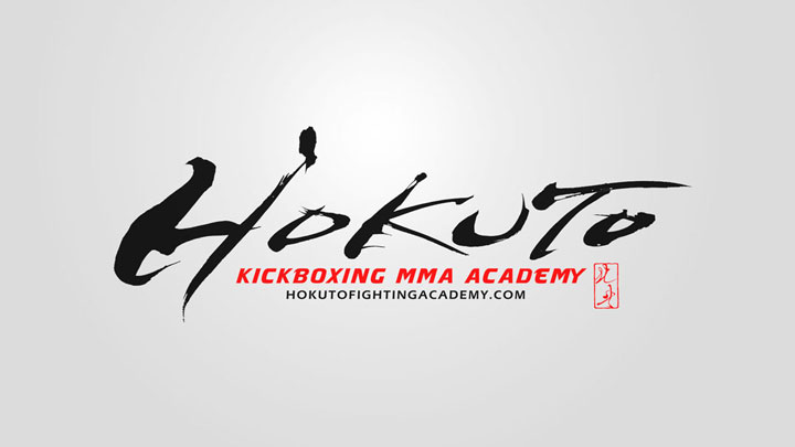
The Spirit Behind the Logo
The client wished to express the themes of “Japanese identity,” “fighting spirit,” and “dynamic motion” through the logo.
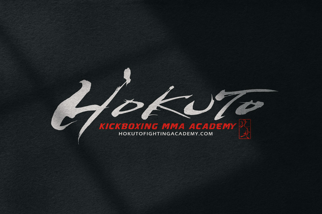
To bring this vision into reality, we designed the word “HOKUTO” in English letters but with traditional Japanese brushwork—a distinctive fusion of cultures.
The uneven lines, brushstrokes, and ink splatter aren’t simply visual effects—they evoke the intensity and rhythm of a real fight.
English Letters × Brush Strokes: A Bold Fusion
While the central word “HOKUTO” is written in Roman characters, its strokes are drawn with the expressive power of Japanese calligraphy.
-
Bold, aggressive strokes convey explosive power
-
Textural brush effects evoke sweat, grit, and determination
-
Sharp finishing points suggest the precision of a fighter’s technique
This is more than just a logo—it’s a visual embodiment of the gym’s fighting soul.
The Impact of Red: Passion and Visibility
The subtext “KICKBOXING MMA ACADEMY” is rendered in a vivid red, adding both emotional intensity and high visibility.
Red symbolizes passion, energy, and focus—all qualities directly connected to combat sports.
It also visually anchors the logo, making it pop on websites, signage, and print materials alike.
About the Seal in the Corner
In the lower-right corner of the logo, you’ll find a small red seal—a traditional Japanese “hanko” stamp.
This subtle detail evokes a sense of authenticity and refinement.
It also gives the logo a final “signature” touch, completing the artwork with a sense of craftsmanship and trustworthiness.
The Creative Process and Client Collaboration
We began the project with a thorough consultation, learning about the gym’s values and future vision.
Some of the key requests were:
-
A logo that blends Japanese tradition with modern design
-
A design that resonates both locally and internationally
To meet these goals, we proposed a hybrid concept that combined brush calligraphy with English typography—creating a strong and culturally unique identity.
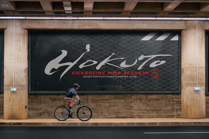
A Logo That Strengthens Brand Identity
A logo is more than a symbol. It’s a powerful way to communicate your brand’s story, energy, and professionalism.
The HOKUTO logo succeeds by offering:
-
High visual impact at first glance
-
Clear differentiation from other gyms
-
Emotional expression of strength and discipline
It’s a logo that not only looks strong—it feels strong.
Considering a Brush-Style Logo for Your Brand?
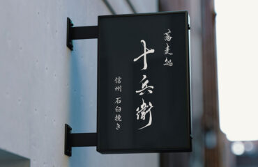
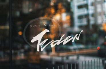
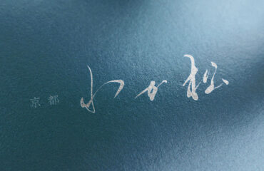
Brush-style logos are especially effective for martial arts gyms, restaurants, or brands rooted in Japanese culture.
They combine energy with elegance, delivering an unforgettable impression.
If you’re:
-
Opening a new gym or brand
-
Looking to refresh your existing logo
-
Planning to expand into international markets
…we’d be happy to help you explore design possibilities.
Let us work with you to create a brush-style logo that embodies your brand’s spirit in every stroke.
Other Introduction
Karate Dojo Logo Design – Seishikai

