Creating a Memorable Brand Identity with Japanese Brush Calligraphy
Creating a Memorable Brand Identity with Japanese Brush Calligraphy
In this article, we’re pleased to introduce the brand logo we designed for the creative agency “HIBIKI CREATION.” Combining the elegance of traditional Japanese calligraphy with a clean, modern Western font, this logo visually expresses the brand’s core philosophy and worldview.
With the guiding message “Think. Create. Inspire.,” HIBIKI CREATION seeks to make ideas resonate. Through this article, we would like to share the concept and creative intent behind the logo and the design process that brought it to life.
The Meaning Behind the Name “HIBIKI”
The Japanese word “響 (Hibiki)” carries the nuances of “resonance,” “transmission,” and “reaching the heart.”
The name “HIBIKI CREATION” reflects the desire to become a creative presence whose ideas and work resonate deeply with people.
By combining the kanji character “響” with the English text “HIBIKI CREATION,” the logo brings together elements of tradition and modernity, East and West, in perfect harmony. It was designed to reflect the brand’s Japanese roots while maintaining a global perspective.

A World Where Calligraphy and Western Fonts Coexist
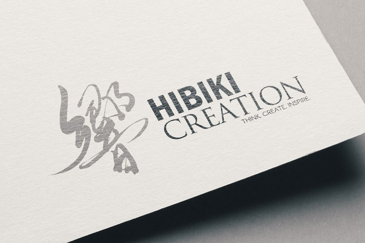
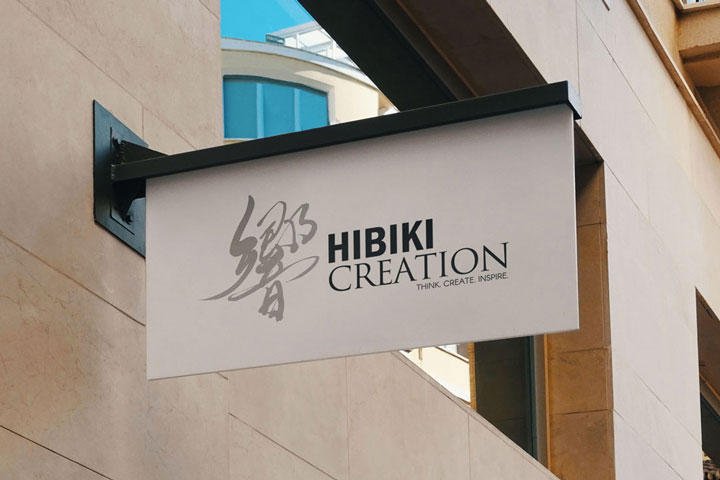
The kanji character “響,” placed on the left side of the logo, is not merely decorative. It is an original piece of brush calligraphy created with careful intention and energy in every stroke.
In contrast, the English text “HIBIKI CREATION” uses a refined, modern serif typeface that evokes clarity and professionalism.
The fusion of expressive brush calligraphy and a sharp Western font symbolizes the brand’s core concept: the harmony of diverse sensibilities.

Color Scheme and Composition: A Thoughtful Balance
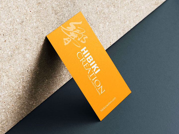
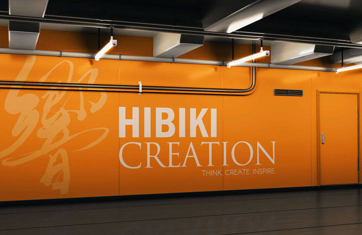
The vibrant orange background symbolizes creativity, positivity, and uplifting energy. It was chosen to intuitively convey the brand’s spirit and its “Think. Create. Inspire.” message.
The combination of the soft beige brush character and clean white typography creates a sophisticated yet approachable impression, achieving visual harmony with a subtle contrast.
The layout—with the dynamic calligraphy on the left and the stable Western text on the right—strikes a balance that reflects both movement and order.

The Vision Embodied in the Logo
The message “THINK. CREATE. INSPIRE.” reflects HIBIKI CREATION’s creative philosophy.
This logo is more than a symbol; it serves as a visual expression of the brand’s values and direction. The interplay of bold brushwork and composed typography conveys a balance of passion, harmony, and thoughtful innovation.

In Closing
The HIBIKI CREATION logo was designed not simply to “communicate,” but to “resonate.”
Each element—from the calligraphy and typography to the color palette and layout—was carefully considered to embody the brand’s identity and future vision.
We hope this article offers some insight and inspiration to those considering their own logo design or exploring ways to express their brand visually.
Other Introduction
Karate Dojo Logo Design – Seishikai

